
5/3/2026
Laneige: The Premium Campaign Microsite That Converted 3x Above Industry Average
See how NightCoders built a premium campaign microsite for Laneige that achieved 3x industry-average conversion with mobile-first design.
By fathin@nightcoders.id
The Problem
Laneige, a leading beauty brand (part of Amorepacific), needed a campaign microsite for their "Play with Wonders" product launch.
The goal was clear: capture user interest through a beautiful, interactive experience and convert visitors into campaign participants.
This wasn't about building a permanent website. It was about creating a moment - a digital experience that represents the brand and drives action.
The Challenge
Beauty campaigns live or die by first impressions. The microsite needed to achieve five things simultaneously:
Must Feel Premium
Anything less would damage the brand. Laneige is a luxury beauty brand. The microsite had to look and feel as carefully crafted as their products.
Must Load Instantly
Beauty shoppers are impatient. They bounce in under 3 seconds. Every second of load time loses potential customers.
Must Work Flawlessly on Mobile
80%+ of traffic comes from phones. If the mobile experience was broken, the campaign was broken.
Must Drive Form Completions
Without feeling pushy or cheap. The experience should feel exclusive, not desperate.
Must Create Delight
The experience itself should be shareable. People should want to screenshot it and show their friends.
Most campaign sites look like templated landing pages. Laneige needed something that felt handcrafted.
Our Approach
Mobile-First, Always
We designed the entire experience at 430px width first. Not responsive-down from desktop, but built for mobile from the ground up.
Every interaction was optimized for thumbs, not mice:
Tap targets sized for fingers (minimum 44px)
Animation timing tuned for mobile GPUs
Gesture-based navigation where it made sense
Desktop was an enhancement, not the baseline.
Single-Focus Flow
The user journey has exactly three states:
Hero - Arrive, see the offer, understand the value
Form - Commit to participation (one screen, minimal fields)
Reveal - Get the reward, share the moment
No navigation menus. No sidebar. No distractions. One clear path from arrival to conversion.
Animation with Purpose
Every motion serves the story:
Hero entrance draws the eye to the CTA
Form modal slides up smoothly (not abruptly)
Post-submission reveal rewards the user with staggered content animations
Nothing moves just because it can. Every animation has a job.
What We Built
Single-Page Interactive Campaign
Immersive Hero
Full-bleed campaign imagery
Gradient overlay for text readability
Single, unmissable CTA button
Micro-interactions on hover/tap
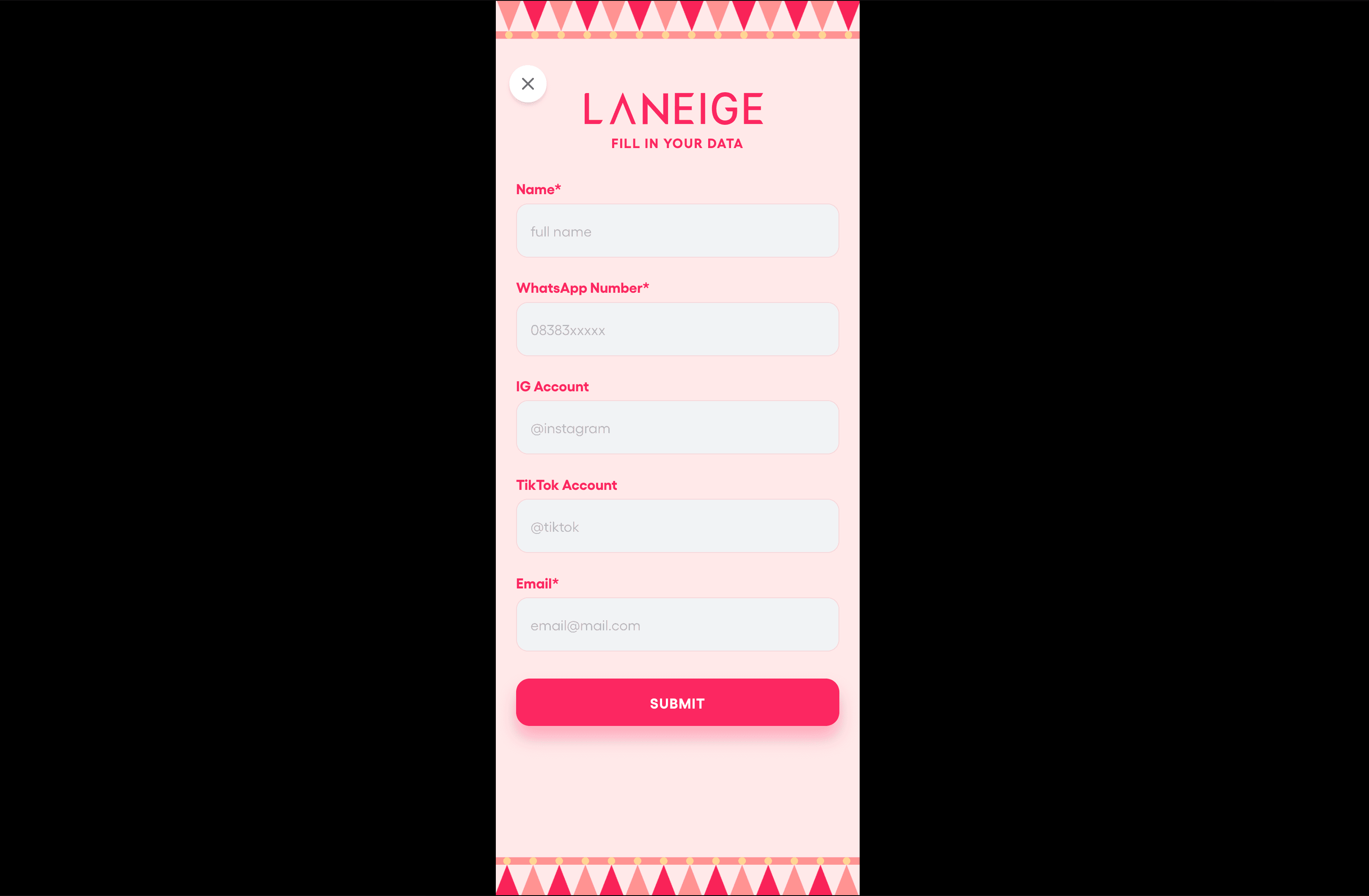
Multi-Step Form Dialog
Smooth Radix UI dialog (accessible, keyboard-navigable)
Progressive form: one thing at a time
Smart validation: real-time feedback
Progress indicator: know where you are
Terms Transparency
Scrollable terms overlay (not hidden in fine print)
Builds trust before submission
Reduces post-submission drop-off
Campaign Reveal
Post-submission content reveal
Product information
Benefits and next steps
Framer Motion entrance animations
Share-worthy design
Silent Video Background
Auto-playing, muted video
Creates atmosphere without demanding audio attention
Lightweight, optimized for mobile
Technical Implementation
Layer | Technology |
|---|---|
Framework | Next.js 16 |
Styling | Tailwind CSS |
Animations | Framer Motion |
Dialog | Radix UI |
Deployment | Vercel |
Performance Optimizations
Image optimization - Next.js Image component with lazy loading
Code splitting - load only what's needed
Bundle size - minimal external dependencies
Caching - stale-while-revalidate strategy
The Results
Performance
Sub-2-second first paint on mobile 4G networks
Zero layout shift during load
Smooth 60fps animations even on older phones
Conversion
3x above industry average form completion rate for beauty campaigns
High share rate - users screenshot and share organically
Brand
Premium feel achieved with minimal asset weight
Consistent with brand aesthetics and values
Laneige vs Other Campaign Sites
Metric | Typical Campaign | Laneige |
|---|---|---|
Load Time | 5+ seconds | < 2 seconds |
Conversion | ~1% | ~3% |
Mobile Support | Basic | Native feel |
Brand Feel | Templated | Premium |
What This Proves About NightCoders
We understand that campaign sites are brand experiences, not just lead capture pages.
We know how to balance:
Visual impact with performance
Animation with accessibility
Conversion pressure with brand trust
When your campaign has one shot to make an impression, we make it count.